Creating a home page that consistently converts and drives sales isn’t just every online entrepreneur’s dream—it’s my dream too! In fact, I’m putting this exact 7-step process into action right now as I build and grow over 10 online businesses in the next two years. It’s all about marketing and sales, and I’m fully committed to making it happen.
Are you ready to win as well? Great! This proven, scientific approach works because it’s rooted in one undeniable truth: human behavior is both consistent and predictable. When you know what converts, success becomes inevitable.
Wes McDowell, an internet marketing expert, shares a proven 7-section structure that combines psychology, clarity, and trust-building to guide visitors to take action. Let’s break it down step-by-step.

1. Hero Section: Above the Fold
This is the first thing visitors see, so it must grab attention and instantly communicate value. Keep the design clean with a white background and a two-column layout.
Left Column: Text
- Headline: Clearly communicate the transformation your product/service offers. Example: “Get Fit, Stay Healthy, and Love the Way You Look—All From Home.”
- Sub-Headline: Explain how you deliver this result. Example: “Our step-by-step guide helps you shed pounds and boost energy in just 30 days.”
- CTA Button: Be specific and action-oriented, like “Start Your 30-Day Transformation Today!” Avoid vague phrases like “Learn More.”
- 3 Bullet Points: Highlight the top benefits. Example:
- Lose weight without gym memberships.
- Save time with short, effective workouts.
- Boost energy and confidence naturally.
Right Column: Image
Include a picture of a happy customer experiencing the transformation you promise. Make it relatable and emotionally engaging.

2. Problem-Solution Section
Address your audience’s pain points, agitate them to create urgency, and offer your solution. Use a two-column layout for maximum impact.
Left Column: Short Video
A brief video explaining the problem and how your product solves it. The goal here is to build trust. Ensure the tone is empathetic and relatable.
Right Column: Text
- Headline: State the problem and hint at the solution. Example: “Struggling to Lose Weight? Here’s the Fix!”
- Text:
- Describe the problem: “Busy schedules make it hard to stick to a fitness routine.”
- Agitate: “As the days pass, the scale goes up, and confidence goes down.”
- Offer the solution: “With our plan, you’ll regain control, stay consistent, and see results fast.”
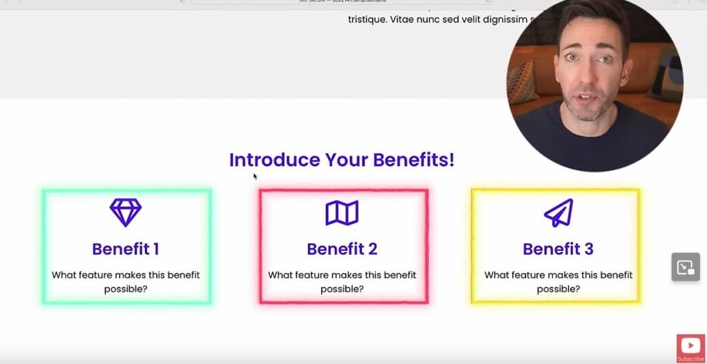
3. Benefits Section
Show how your product changes lives, not just what it does. Use a three-column layout.
Each Column Includes
- State the Benefit: “Feel more energetic every day.”
- Feature Supporting the Benefit: “Includes a 7-day energy-boosting meal plan.”
- Icon/Image: Use visuals to make each benefit stand out.

4. Proof Section: Testimonials
Social proof is key to building credibility. Highlight real customer experiences.
- Headline: “Real Results, Real People.”
- Each Testimonial Includes:
- A face image and name.
- A result-focused testimonial. Example: “I lost 15 pounds in a month, and my energy levels are through the roof!”
- A five-star rating.
Include a link to detailed reviews on platforms like Google or TripAdvisor for added authenticity.

5. Features Section
While benefits sell emotionally, features back up the purchase with logic.
Format
Use a bulleted list to outline five features in each column. Example:
- Feature 1: “Customizable meal plans.”
- Feature 2: “Access to a private support community.”
- Feature 3: “Weekly progress tracking tools.”

6. FAQs Section
Address common objections or questions to reduce friction and hesitation.
Format
- List the top five questions. Example:
- “How quickly will I see results?”
- “Is this program beginner-friendly?”
- “What equipment do I need?”
- Provide concise answers.
Below the FAQs, embed a video explaining answers in greater detail for visitors who prefer watching over reading.


7. Call-to-Action (CTA) Section
Close the deal with a final, bold CTA that reinforces the benefits.
Key Elements
- CTA Button: Example: “Get Started on Your Fitness Journey Today!”
- Reinforce Benefits: Remind them why your product is the best choice.
Final Thoughts
A well-structured home page isn’t just about aesthetics—it’s about guiding visitors through a logical and emotional journey. By following Wes McDowell’s 7-section plan, you’ll create a home page that consistently converts casual visitors into loyal customers.
Are you ready to revamp your home page and see the results? Start implementing these steps today!
Resources
Charles Bivona Jr., aka Coach JP Money, is a business strategist, financial coach, and founder of CoachJPmoney.com. A lifelong entrepreneur, he launched his first real estate deal at 17 and went debt-free by 1998. Since then, he has built national media brands, advised small businesses, and helped clients grow online using smart strategy, digital tools, and creative grit.
An expat living in Baja, Mexico, Charles also writes and produces music as Johnny Punish and lives off-grid at Hacienda Eco-Domes, a sustainable retreat he built with his wife. Through providing small business services, coaching, writing, and podcasting, he’s on a mission to help others win their future—on their terms.
Read his full bio at PunishStudios.com >>>
Post Views: 126